Japan Travel Photos: Tokyo, Kyoto and Niseko

Radich_Tokyo_Shinjuku_1

Japan has got to be one of the best places to travel with a camera –  the hyper-industrialised cities, bright lights of the shopping districts, old temples and shrines, not to mention the epic snowscapes. Japan is full of epic visual scenes. And so it was a dream to finally be able to visit Japan this year … for snowboarding, and photography.

Along with what Apple likes to tell us is the “World’s most popular camera” in my pocket at all times, I travelled to Japan with my new Canon EOS 1D Mark IV, a pocket Canon Powershot AS3300 IS and a funny Russian panoramic 35mm film camera, a Horizon Perfekt. Have you had a look at the quick little blog posts of my iPhone photos from Tokyo and Kyoto? Well, here is a selection of my non-iPhone snaps.

I bought the old fashion, fully mechanical Horizon Perfekt from Lomography, and this trip in February was my first real chance to use it (besides one test role). The Perfekt uses a swing lens that moves left-to-right to project a 120-degree-wide image across almost two normal frames of 35mm film. As with any film, and particularly as I wanted to cross-process Fuji slide film, using the Perfekt was a little bit hit or miss – but that’s the fun of film! I took along a digital light meter to try and take some of the exposure setting guesswork out of it, and some of the results came out great.

As it’s taken me so long to post these extra non-iPhone photos, I think in future I’ll travel on non-photographic trips with just the little phone, and maybe a film camera for fun. I hope you enjoy these photos, as much as I enjoyed taking them.

Click on the photos to view them in a pop-up gallery…

To see more from Japan take a look at my iPhone shots from Kyoto and Tokyo.

Advertisement

Behind the Scenes of Snowboarder Issue 2…


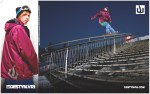
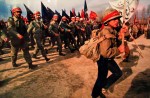
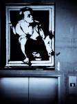
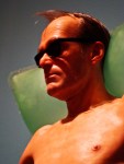
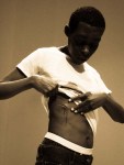
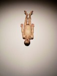
Issue 2 of Australian-New Zealand Snowboarder has been out for a couple of weeks now, and it was a productive issue for me, including another double-page-spread advertisement for Destyn Via. This time the photo was of Cohen Davies taken on the June Mountain stair rail. Here’s the original shot, which you can see has been cropped a bit, I guess to enlarge Cohen and his DV gear.

It was great that Linton from DV was willing to negotiate to purchase another photo, instead of just re-running the Darragh photo – not only did it give Cohen a big exposure boost, but it advertises some other “colourways” of the gear and shows the breadth of their team…and it was nice to see they spelt my name correctly this time! Check out my previous entry here and Olliepop Films’ video of our trip here.

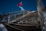
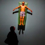
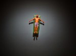
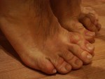
On that same June Mountain trip two photos I took of Darragh made it into his 7 page interview that I conducted with him. The above shot is a slightly alternate angle of his June rail switch frontside boardslide, but the one published had better style. While discussing the upcoming interview with Darragh and living with him and his constant lolly munching, we came up with the idea to highlight this unusual habit in the text, and top it off with a themed portrait shot.

One rainy night at the end of our season we drove all around trying to find a candy vending machine, and finally spotted one out the back of the Tahoe Inn next to the Tahoe Biltmore Casino in Stateline. We snuck in and set up the shot…and of course got hassled by a few curious residents, but fortunately weren’t stopped by any rent-a-cops.  It’s a shame there’s some shadow across Darragh caused by his arm and hair, but with only about 5 minutes to set up the scene and lighting and shoot a few frames before we felt we would be boosted, we didn’t have time to check every frame. But we did manage to capture the feel for the shot that we wanted, and I liked how the magazine designer ran with our theme and gave the article some candy-cane flair.

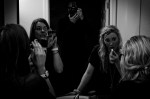
I also thought my 8 page interview with Courtney Phillipson and Jess Rich looked good and came together as a good light-hearted read. As I mentioned in my previous post about shooting the girls in Tahoe, as a visual theme for the article I had envisaged it to be all about mirror images, reflections, and like I said in the intro: “Brunette vs blonde, goofy vs regular, experienced pro-rider vs pro-ranks rookie, measured confidence vs all-out fearlessness.”

I had planned to shoot as many features as possible from opposing angles, as I had a photo layout in mind. I even sent through some Photoshopped arrangments of the photos side-by-side, which I was pleased to see the magazine designer applied when putting the pages together. I think it really captures the mirror-image action theme I was going for…however, they failed to follow my suggestion for a slightly saucy/creepy/arty reflection-in-a-mirror portrait shot.

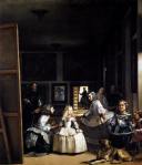
Perhaps the artisitc references for my unusual portrait shot would have been lost on the Aust-NZ Snowboarder reading public? Diego Velazquez’s 17th century painting Las Meninas is the original famous artwork to place the artist eerily within the frame, along with intriguing dark figures and mirror reflections, giving the artwork an overall feeling of unease.

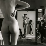
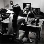
More recently, the revolutionary Aussie-German fashion photographer icon, Helmut Newton, often used mirrors in his work, placing his reflection in the frame as a sort of creepy voyeur in a trench coat, or all in black like here in a hotel room with his wife Alice Springs. This was my true photographic inspiration, and it was fun to try and recreate this sort of image with Jess and CP, and I made reference to the unusual photo shoot in the interview in the hope the shot would make it into the mag. But alas, Evil Editor decided that Snowboarder was not a proper place for some art history education.

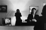
But I’m not the only one who has been inspired by Newton and his use of mirrors – TopShop in the UK even set up a “Newton Machine” photo booth to recreate his self-timer and model-in-the-mirror shoots. Check it out here.

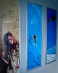
A couple of my Vancouver 2010 Olympics photos of Torah Bright made the issue, but I believe the bulk of the action shots will run some time on the magazine website.

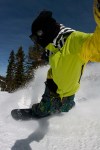
But the biggest thrill for me in this issue was my quarter-page self-portrait pow slash from Northstar that ran on page 17! I think this is the second action shot I have featured in among the pages of Snowboarder over the years. Dragon get good exposure with their goggles in this shot, but unfortunately for Nitro, I had split the nose of my board out at Donner the previous day and was riding an old loan board while my Nitro “Team” 159 was being repaired. But maybe I should still try to claim a photo incentive payment from Dragon?

For this shot I was inspired by a couple of Frode Sandbech point-of-view covers I had seen overseas, and I played around a few times with my 15mm fisheye and motor-drive as I followed the girls down through the park while shooting them for their interview. Clearly I’m not the only one who had noticed Frode’s shots – take a look at the cover of issue 2 of Snowboarder if you haven’t seen it on the shelves. This shot from a previous blog entry was another POV experimentation from the same session.

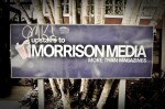
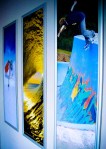
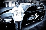
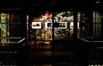
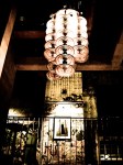
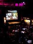
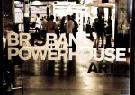
I was able to thank Evil Editor, Ryan Willmott, in person for putting me in his magazine, as he came up to the Gold Coast for a week to finish off issue 3 in the Burleigh Heads HQ of the publishers Morrison Media. He was pretty stoked to show me his new free ride, a stickered-up Toyota Rav 4. It was cool to check out a bit of the behind the scenes of magazine publishing, and get a preview of issue 3, which has our Los Angeles trip in a big, colourful feature article…and also pick up a few free mags. Look out for that issue on the shelves very soon…and take a look at some shots below from my visit to Morrison’s head office.

Go Ride a Custom Craft!

Every man should own at least one fully tailored suit in his lifetime, but unless you get some dodgy polyester three-piece from a pushy Indian on Khao San Rd, you’re going to have to save some serious money to get a sartorial suit. Equally, hand-made custom Italian shoes, or even bespoke Australian hardwood furniture will set you back a pretty penny. However, if you want to stand out from the bland crowd and have your own custom fix, all is not lost. Instead of grabbing one of those boring white surf sticks off the rack, why not go to a local shaper and get a custom board?

With the international push for factory-manufactured surfboards, hand-shaping is certainly a dying art. And where it once was a burgeoning life progression for surf bums and failed pro-surfers, lately, small-time shapers have been struggling to even find grommets to come in and sweep away the shaping booth floors. It has become such an issue that lately the surf industry even consorted with Creepy Hitler (ie Tony Abbott) in a push for surf shaping to be regarded as a legitimate recognised trade that can then employ certified apprentices. See the article from Surfing World here.

The Gold Coast is littered with world-class surfboard shapers, with DHD and JS Industries creating boards for a huge proportion of the top surfers in the world. But as these boards are in high demand, the price and waiting list was a little longer than I wanted, and so after seeing how well El Rad rode a 6’1″ Stuart Surf FX1, I few weeks ago I ordered a 6’8″ version…and for just $100 more got an all-over orange spray and hand painted silver lightning bolt! And less than 3 weeks later I picked up my bespoke board, complete with my name along the stringer, handed directly to me by Stu himself. Oooh…how I love the smell of fiberglass in the morning!

There really is something satisfying about the whole process: checking out a bunch of different local shapers, chatting to them about your surfing ability and immediate aspirations, seeing the shaper work on similar boards in his shop, scoping his finished boards and lairy paint schemes, getting quotes and prices, ordering your custom stick, then picking it up and giving it that first careful test drive out in the surf…and strutting along the beach with your new colourful creation with a huge smile on your face afterwards. And as El Rad took advantage of a buy-two-at-0nce discount, we both got bespoke boards for a similar price to an off-the-shelf Studio Italia suit from Myer!

Surfing World Magazine recently had a whole issue focussing on hand-shaped and custom boards, and Base Surfboards (a co-op of DHD, Bourton, Simon (Anderson) and others) has a great page which outlines all the steps that go into making a board. Basically, cutting machines carve down a foam blank to within 70-85% of the finished board shape before the rest is sanded back by hand, then it’s fiber-glassed, artwork is painted, fins inserted and final glassing is done to the board.

And El Rad even went a step beyond the hand painted scheme that I ordered from Stuart’s collection – with modern advances in colour printing any image can be bonded to cloth which is then laminated under the fiberglass. And so taking influence from classic art, and willing to wait the extra week or more to finalise the printing that I wasn’t willing to wait, take a look at his “Liberty” HPX2 (a model which received a great review in ASL’s 2010 Surf Bible)! The half naked woman is in fact the central figure from Eugene Delacroix’s famous revolutionary painting, “Liberty Leading the People”. The board looks amazing, with a great painterly print effect – I’m jealous – it makes my orange bolt look tame, and puts the other boards in our collective quiver to shame. And not only is El Rad bringing some art to the sometimes shallow world of surf…and he gets to rub up against a beautiful topless woman every day out in the water…even if she is 180 years old!

Boobs and Beaches? There’s more to S.E.Q…

It’s not all boobs, beaches and barrels up here in South East Queensland – in fact there is a depth of culture that Melburnians may be surprised at. Australia’s Southern city does not have a monopoly on culture, no matter what some “Sex and the City” wannabes may tell you. Yes, Surfers Paradise and the Gold Coast is a little light-on in the artistic and cultural realm – everybody is too busy checking the surf – but less than an hour up the road, little ol’ Brisbane has Queensland culture covered.

Brisbane is a fun little city with a good array of unique architecture, trendy spots and hipsters-in-black to provide a cultural contrast to the salt-encrusted hair and golden-tans of the Goldy. Last week we made the easy drive up to the Brisbane Powerhouse for the 16th installment of  the frequent Pecha Kucha nights held there to get our cultural fix.

Pecha Kucha:

Pecha Kucha is a the 20-20 Cricket of the art world…literally! About 8 to 12 creative individuals get up on stage to show 20 jpeg slides for 20 seconds each and chat about them. This limits each “artist” to 6 minutes 40 of presentation time so they don’t waffle on in a self-absorbed daze, and it gives the audience a panoramic snapshot of some of the diverse creative pursuits are being followed in their home town. Any sort of creative type can get up, from architects, to painters, furniture makers, graphic designers and commercial advertisers and filmmakers. It was started by a couple of architects in Japan, and one of the “inventors”, Mark Dytham was on hand last week to discuss his creation. I think he’s on the right track, not taking the concepts of “art” and all it entails too seriously- art is to be enjoyed not laboured over, with Mark telling the audience to make sure they head to the bar and stay out late as Pecha Kucha is all about “drinking, then thinking”. Pecha Kucha is held in 314 cities across the world (including Melbourne) – find out more about it here.

Brisbane Powerhouse:

The Powerhouse is a great location to hold Pecha Kucha. It is an amazing former-industrial space converted to a glorified gallery, bar-cafe and classy date-spot sitting majestically right on the wide Brisbane River, overlooking rich houses and schools on the opposite bank. But the bit I like most is how the re-developers have kept much of the original graffiti that was sprayed on the walls when the building lay abandoned for decades. And to show how art can turn full-circle, inside the Powerhouse there is a new Blek Le Rat feature stencil artwork (which would be called vandalism by Victorian politicians and whitewashed over), which itself takes aim at the question of “what is art?” It seems to me that Blek‘s classical figure is reaching out from his gilded gallery frame to grab a spray can in a statement that stencil/street art should now be recognised as a legitimate artform worth displaying. Part of the reason the Powerhouse commissioned the “Godfather of Street Art” to paint their wall is that the building is actually heritage listed for its graffiti! I wish Melbourne had a building as cool as the Brisbane Powerhouse. And while researching this blog I discovered that Blek also painted two more pieces on the exterior of the Powerhouse, which I will have to go back and find.

Another pleasure last week was to discover that the Powerhouse was showing a collection of war photo-journalism photography, from Vietnam, via Africa and the Balkans, up to current-day Iraq and Afghanstan. It was interesting to actually see some photos by the enigmatic Sean (son-of-Errol) Flynn, who Dennis Hopper based his American Photojournalist character on for “Apocalypse Now“.  Coincidentally, I had been reading an old novel by Colin Falconer called “Dangerous” which had a very Sean Flynn-like character (named “Sean Ryan”, who was a Hawaiin-shirt wearing, war-photo-chasing  adrenalin junky, former minor hollywood hunk and son of a famous Hollywood alcoholic womaniser…hmmm, Falconer must have just plucked those character traits from thin air!) It was chilling to consider the horrific scenes these photographers capture when compared to the light and fun world of wintersports which I operate in. I am glad I have never been at all tempted by photo-journalism, least of all war photo-journalism. If Falconer’s book is anything to go by, it would be almost impossible to lead a normal life after being stuck in the thick of the action trying to get a photo to help explain the insanity of war. Take a look at my photos below of what the night was like – I did get into a little bit of trouble to taking photos of the photos, but hey, what’s a bit of copyright infringement between friends?

Now if SEQ could just have a good cafe I’d never have to move back to Melbourne: all we want is a quaint little place that serves good coffee, quickly, has good food at decent prices, with free newspapers and magazines, and stays open later than 4.30pm on a weekday and 3pm on a sunday. Is that too much to ask?

Melbourne: Get some culture up ya!

It’s been a change for me being back in Melbourne for Easter, catching the last heat of summer and seeing the pre-autumn city the way I haven’t seen it for more than 5 years. With the first tinges of brown on the leaves and the water still warm down on the Surf Coast, I’m starting to again see some of the attractions of this city.  And with a couple of interesting exhibits on, I thought it was time I headed into town and took a look at my city through the eyes, and lens of a tourist…

First up was a trip to the NGV International to see the inspirational work by Ron Mueck, with a handy free-entry pass from a school friend Caterina, who now works at NGV. Mueck is an amazing artist, with an ability to capture “life” of a figure in his sculptures not seen since Michaelangelo. It is absolutely mind blowing what he is able to do with some resin, fiberglass, paint and synthetic hair. If it wasn’t for the hyper- and micro- scale of his sculpures you could think that real humans are right in front of you, and their nudity is so life-like and confronting, sometimes you don’t know where to look. His ability to capture the sponginess and detail of skin, complete with moles, wrinkles, goosebumps and hair is a true wonder. It reminded me of the ‘lightness” and deftness of touch Michaelangelo achieved with his Pieta. Yes, the old master was carving out of marble 500 years ago, but I reckon if he was around today he might take inspiration from Mueck and try the equally as solid fiberglass as a medium for his statue to celebrate the city of Florence. Don’t you think that in black and white, and if you added some horns, this face could almost be Moses?

And the great thing about the exhibit is that Mueck wants viewers to be able to take photos of the work. It was great seeing so many people enjoying the sculptures and so amazed by them that they just had to capture a likeness on their iPhone. But from this article in The Age, I guess Myf Warhurst doesn’t share my enthusiasm. Take a look at the detail of these feet – this photo could be of a real person, as you can’t tell they are at least two-times scale.

Unfortunately the NGV Ron Mueck exhibition just ended, but for more information about him click here and here. And here’s an article which goes into Mueck’s actual production of his artworks, showing some photos from start to finish.

Next on the culture hit was my first visit to ACMI, the Australian Centre for the Moving Image, for Dennis Hopper and the New Hollywood. ACMI is hidden amongst Federation Square and overshadowed by the amazing NGV Australia. ACMI is all about film and TV, and so I wasn’t all that interested in the permanent display, although there are a few cool interactive exhibits, and it might be just about the only place in the world where video games (which you can play on big screens) are heralded as a true artform. Dennis Hopper, as I found out, was much more than the pretentious Hollywood actor who is now warding off life-ending cancer whilst embroiled in a bitter divorce and child custody battle (check out this creepy photo of him and his daughter – Yes! Daughter!) Hopper was part of the LA art scene in the 60’s and onwards, producing some notable photos, assemblages and paintings, as well as writing, directing and starring in Easy Rider, and being a west coast champion for the artworks of Roy Lichtenstein and Andy Warhol.

Unfortunately this exhibition didn’t allow cameras, but I did like Hopper’s super-sized painting reproductions of his photos, as well as his 60’s and 70’s Hollywood photos and large photos of grafitti detail. ACMI is a strangely laid out exhibition space, and with the emphasis on “moving image” the static artworks by Hopper and others was interrupted by video walls playing snippets from Hopper’s movies. So it wasn’t as impressive an exhibition as Ron Mueck, but I certainly learned more about a very interesting Hollywood character and may have even picked up some more inspiration of my own. While I wasn’t fully impressed with Hopper’s work and the collection in general, I don’t think I fully agree with this other article from The Age: I’m glad that Hopper didn’t just stick to his day job and managed to record Hollywood through a lens, and expressed himselves in other way than film. But perhaps the notoriety of his art has had more to do with the clique of famous artists he hung out with, and then with his Hollywood cache, rather than the actual finished works?

Here’s some info on Dennis Hopper’s various artworks and photography, if you are interested. Otherwise, enjoy my photos from in and around the city and from inside the NGV.